ShopDreamUp AI ArtDreamUp
Deviation Actions


Suggested Deviants


Suggested Collections


You Might Like…


Featured in Groups


Description
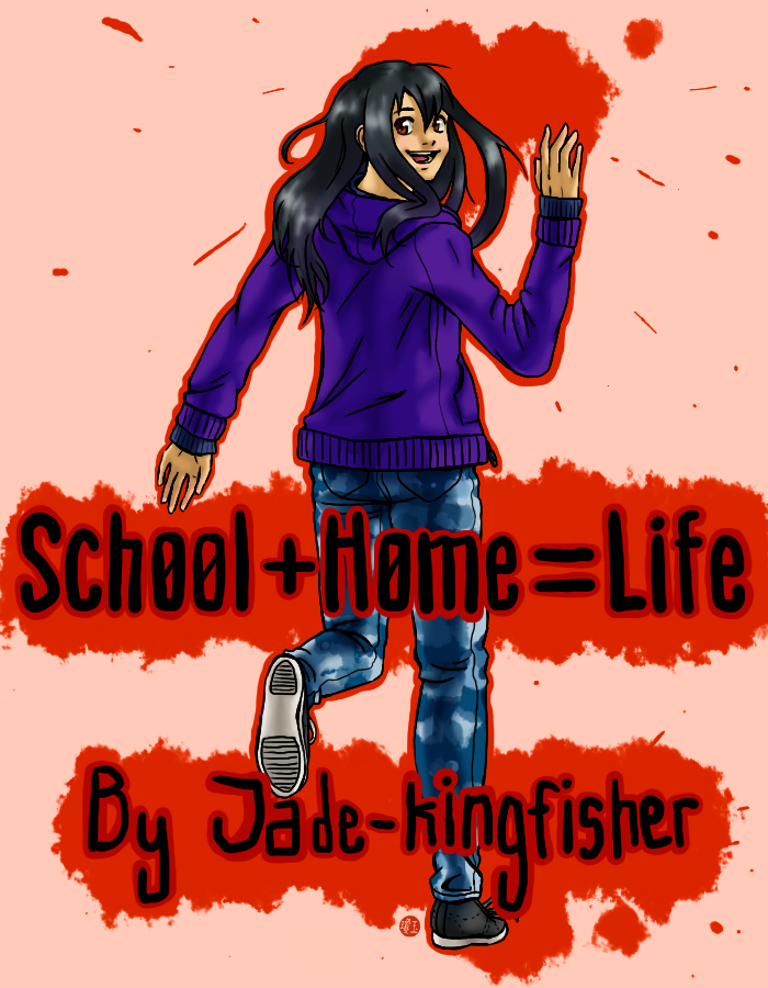
This is the splash page/cover art for my upcoming comic, School+Home=Life ~! 
and hopefully it looks okay ;D
feel free to nit pick at any errors (the colours for example) and tell me how i can improve~
right now im thumb nailing the 1st chapter, and am setting up a smack jeeves account :'D
i plan to have the 1st chapter up by end of feb OTL;;;
oh and when each chapter is updated ill post the cover here, to let you guys know >3<
if you have any questions, about the comic itself or the characters, feel free to ask
pose referenced from: [link]
clothes referenced from: [link] [link]
character and art belong to me *Jade-kingfisher
Image size
700x900px 532.08 KB
© 2012 - 2024 JadeKingfisher
Comments14
Join the community to add your comment. Already a deviant? Log In
I do love your drawing style, and once again you've not disappointed! I love how your characters look so realistic, while still retaining that anime-style look. But now, to give you proper feedback on the overall artwork.
Like someone already mentioned earlier, I find it a tad strange how her body is between the text ans the red backing behind it. I think her body should probably be behind it instead, but that's just me.
Also...(this is something I pick up on a lot) there doesn't seem to be any constant light source that corresponds to the shading and highlights on her clothes and hair. This is something I especially struggle with, and my recommendation is to reference pictures of people with different light sources (by "light source", I am referring to the direction the light is entering from). That way, it may be easier to emulate the placement of shading and highlights in correlation to a light source.
Overall, this is a very nice cover and quite pleasing to look at. Hopefully, my review helps a little!